This post showcases the four designs I've envisioned for The Timeman; using analogue and digital mediums. In fact, the fundamental nature of the mediums themselves have driven the design language quite significantly. Notice the disciplined, geometric forms associated with the two models developed within SketchUp, and how they are completely contrasted by the twisting, organic curvatures of the clay models. Yet all of the designs attempt to engage with the same founding design principle that speaks of the client - the endless and infinite.
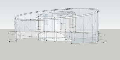
Model 1 (Digital)
Diagrammatic plan illustration,
inspired by the technical watch drawing posted previously
Cylindral elliptical form with central occulus
subterranean entry path, forcing occupants to move around
perimeter and then beneath and then back up again
to enter
Model 2 (Digital)
Diagrammatic plan illustration,
inspired by the infinity symbol
Two major central spaces, one open (upper) and another
enclosed (lower)
Sweeping curvatures that wrap around and inside building
Model 3 (Analogue)
Twisting, knotted form with various facets that fold
up, around and inwards
Central funnel aims to channel light and let it permeate
through the space
Model 4 (Analogue)
Sweeping halo form that folds outwards from central void
Likewise, central peripheral aims to allow light to filtrate
into the interior spaces
This submission required the incorporation of a tower, to invite moments for reflection. My approach to this prerequisite was quite abstract as opposed to literal, where I thought of the tower as a void, or a subtractive volume instead of additive, that pierces centrally through each of the designs. The moments of reflection depend on the success in which light is allowed to penetrate into the interior. Perhaps this process can be enhanced using reflective surfaces such as mirrors?
The resulting circular movement paths created by these forms are usually quite undesirable -in that they create longer travelling times and pose problems when it comes to furnishing the interior- yet this does not apply to The Timeman. He has no sense of urgency. Sprawling movement paths only further emphasise the design language.
This is the first step, in an evolving process. Next, will be to move forward with ONE design solution that references elements from any to all of the original design proposals outlined here.


No comments:
Post a Comment